2.24.2015

Self portraiture continued......(az)

Last week, I realized that I said I had written that I was going to show four spreads and displayed only three. Here is the fourth and a bonus.


My husband took a less than perfect picture of me (below) and printed it out. Rather than toss it (or burn it), I kept because it had my dog in it. I chose to cut off the offensive part and drew in the rest of my face. So in a way it is self portraiture and very silly.
And for those you who are not sure, my hair is not blue. 


Until the next time, 
*az*

2.17.2015

Self portrait challenge revisited (az)

In April 2014,  Sarah challenged us to a self portrait challenge. Feeling less than ambitious, I declined the offer. But then I realized I could take a lazier approach by dredging up some very modified self portraiture that I had previously done using a photograph. 

This is the photograph taken in the 80's. As you can see, I failed big hair. 

I then created these four spreads. While Sarah opted for realism and mood, I went for a more collaged  and colorful approach. I used pastels, paint, markers, and even rose petals.


Until the next time, az. 

Back to the drawing board.(skf)


Hello Everyone,

How about some green in the midst of all of this gray and white?
This are my latest drawings. After creating a number of paintings from my photos of D.W. Field, I found a need to return to drawing. When I paint, the consciousness that I enter into is very formal, full of  histories and procedures, Each brushstroke is a measurement of appropriateness for the place in the developing puzzle. Or translation: as your image is built by all of the classical elements of painting you are also gauging each mark in relationship to the next. Does this brushstroke work better than another?
For me it is highly cerebral. I wanted to let my hair down and make my painting a little more like the way I like to draw.
This work on the left is "The Tree Dervish"
 I used watercolor crayons so I could enjoy the sketchy movements of a graphic mindset. Later I can go over it with a brush to blend or place an expressive mark without being so tight.


 With the next work, I went back and forth
 from painting to drawing.
 I still think it is a bit stiff so on my next work,
 I decided to only draw.


 The trees are create by the absence of any medium.
 This challenges me about fully using the negative space.


 Then the leaves are secondary to the image. I like the woodcut effect.


 Oddly enough, this blue work feels the most honest and it's my least favorite. So what's the deal with that?


Still, I want a looser, freer way of working.


On these three drawings, I went back and forth between using my brush for flat color outlines,then using my pencils and crayon for definition. Shapes would come forward then retreat so it hopefully shimmers  at the edge of realistic and abstraction.

As I pinned them up on the wall, put down my handful of instruments I stood back and thought about the effectiveness of my method. I sensed I was onto something.

Now all I need to do is repeat this process a couple hundred times then I'll know if it's authentic or not.

I hope you are inspired to try your own version of this winter madness. The more color you use the less stir crazy you'll be.

Keep the faith, it will warm up soon.

SKF


2.02.2015

following your nose -kes

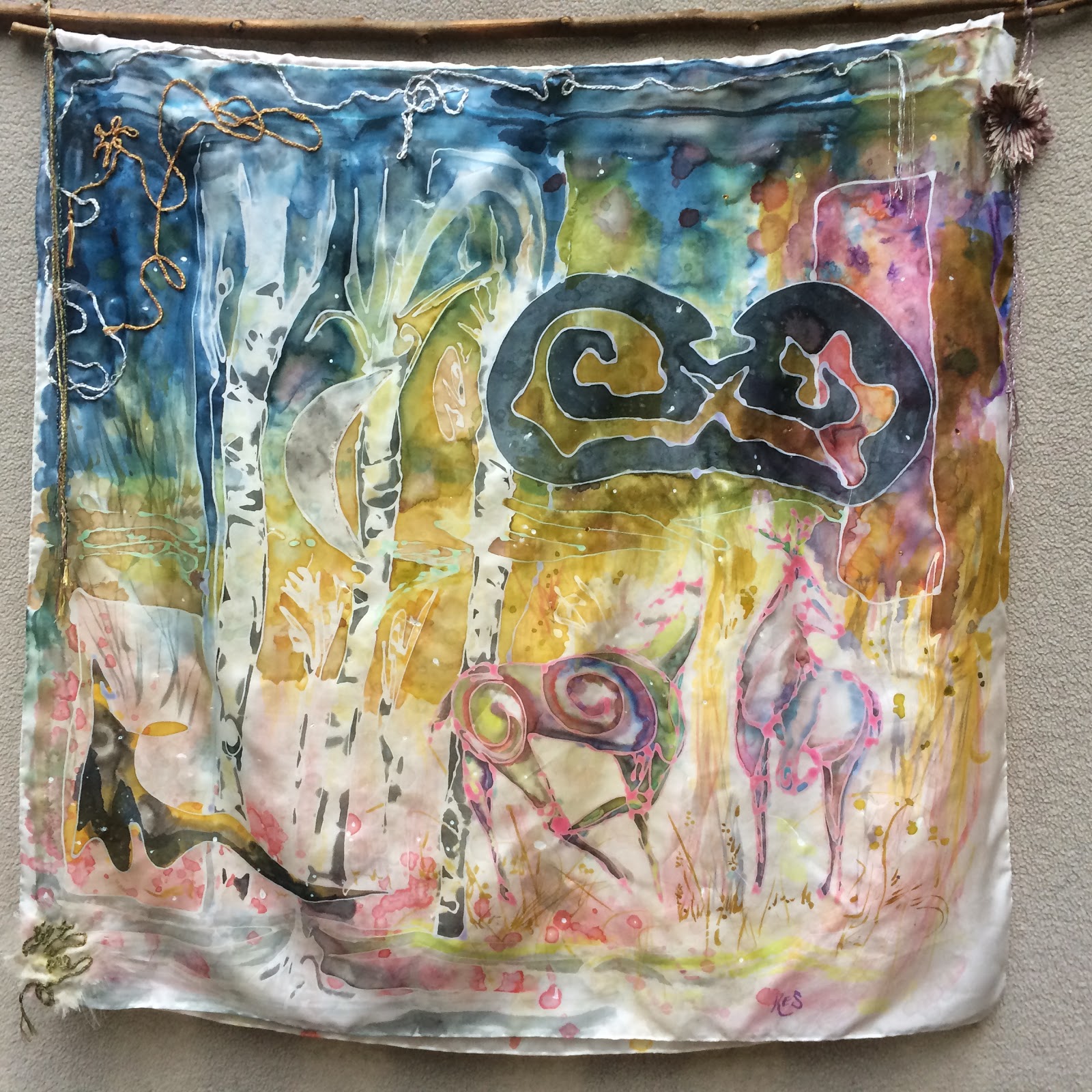
the evolution of an artistic work has probably as many possibilities as there are human personalities in the world creating. its been a little over a year since this blog emerged. the first real activity i described was to celebrate the year of the wood horse. you can find that posting here.

its amusing that almost to the day, a year later, there is a need to tell how and where the origins of that piece came from. here's the back story:
intention-make a large silk painting, spending time remembering the equine friend no longer part of my life (no crying allowed, he's not dead...but the piece is more significant than doodling).
step 1->prepare the silk by washing to remove the fabric sizing
step 2->iron dry
step 3->draw horse imagery on paper to work from. the head says its going to be a Baroque steed in all its power, fire, and glory. he has spanish bloodlines in him.
step 4->the images [from Jan 2014 archive post] are what comes out and well, they suck. 
[s]he takes a step back and slowly realizes that the whole thing is wrong: "It's not what I meant...not the vision I had"....just like Gulley Jimson in the movie 'The Horse's Mouth'.

step 5->how to fix the creative dilemma was to give up. not the typical modus operandi from one who enjoys the fight. midlife crisis is about learning how to go about the day differently. the art was by no means the crisis, the horse was. if i can let a horse go, i figured why not let go of my right handed drawing controls too. let the left hand drive. years ago swapping hands started as relief for a very tired limb. interesting metaphor as the metaphysical rationale was more than apropos.

step 6->sit on the floor with a sharpie in hand and many nice big white sheets of paper. waste it even.
the drawings came out in the order presented left to right and going down, as shown below:


on these last two above, the buck's angular marks and the doe's soft curvy lines peaked my interest. something to follow. below is what happened next. two more deer images appeared, each on their own pages, like the individual ones above.

using a separate, big piece of nice printmaking paper, a tree scene came out next. i remember i was thinking about birch trees. i like them very much. there is a special piece of private land in VT that i rode the horse through. its high up on a hill, the field is full of birth tree clusters that are like sentry between the living and dead. i liked the deer so much i just cut them out and glued them on top of the tree imagery. then i drew a moon...a year later i still have no idea what the funky shapes are for. but i really like them.

so in the end i was remembering the horse after all...with me, in the birch trees. 
i just realized this now. thanks Gail, for asking about it. 

the finished piece is called ' patronus '.  it is sewn onto sumac branches-they look like fuzzy deer antlers. fabric elements are couch stitched on the front painting layer. there is a second painting sewn underneath. embroidered on the bottom left corner are the word's 'lift me'. the thread has a tail, for the viewer to lift and reveal the under layer. JK Rowling fans know the meaning of the word 'patronus'. it is a charm/spell that is able to conjure an incarnation of the caster's innermost positive feelings, such as joy or hope. enjoy.


1.28.2015

artist trading cards -kes


artist trading cards are:
  • a great use of all your studio and journal scraps
  • a business card with no useful contact information. add your contact info and your likely to get a commission or at least be guaranteed that it won't be tossed in the trash.
  • bookmarks for those of you who still read the paper kind
  • a way to look very serious in your studio. its really the equivalent of playing in a sandbox but you will appear 'much too busy' to be cleaning the house, folding laundry, or acting responsible.
artist trading cards are so popular they have their own wikipedia entry.
http://en.wikipedia.org/wiki/Artist_trading_cards
google images and pinterest are a way to lose a whole day soaking up the creativity vitamins bursting from this planet's inhabitants. time well spent. there are workshops, guidelines, and swap meets to get involved in. find whatever sandbox your likeminded artists are playing in and get in there too.

i took a workshop last year on this topic because winter is long. i've yet to follow the workshop protocol at home. no need to spend money or follow rules. below is how i made the card in this post:

chop a piece of mat-board too small for framing use.
add papers, plain & stamped fabric, a rhinestone. make these things yourself as much as possible. you can do it. run with the scissors.
cover both sides. it doesn't need to match.
i used glues & medium to stick it all together on the mat-board.
the front of this card is coated in cera colla, a raw beeswax and ammonium hydroxide cold wax medium.
the recipe was courtesy of Don Jusko. a huge pile of thanks to Don. while Don is an artist, his analytical mind and ability to record usable 'how to details' rivals PhD scientists and the minions working for them-I work with these people daily in the biotech industry. check out the decades of work and experience Don posted online at http://www.realcolorwheel.com
more on my cera colla experimentation in the next post.


1.02.2015

make your own universe -kes

in the beginning there is nothing, until there is...

one foamie
http://www.darice.com/store/details/catalog/wholesale-foamies-sheets-rolls-sticky-back/1019-95

add one screwdriver


then add one artist


then press the foamie on an ink pad
http://www.staples.com/Ranger-5-x-6-3-4-inch-x-3-4-inch-Archival/product_301539


now press the inked surface on anything you like


on paper


or fabric


or directly onto a painting


this work is from a 3' x 4' mixed media collage canvas.
the painting said it wanted to be a web, and so now it is (detail images)


12.23.2014

Quiet Celebration - az

Please allow me to celebrate the life of a very special greyhound named Sonja.
She inspired many drawings.
These are just a few. 


MCP's Sonja 
2000 ~ 2014

*az*