12.23.2015

mother of dragons-kes

question: what can be made? answer: what ever can be imagined.

this is an industrial printer. it lives at work. not much love for it.


this is what the printer looks like inside. notice the black ribbon waste top center. 
after ink is used once, it rolls up onto the top waste spool.


this is what happens when the artist defiantly gets 'cooking' and 
refuses to put trash in a landfill just once.

egg recipe:
  • [1] industrial waste ribbon-wound on itself like a baseball core
  • add scotch tape reinforcement
  • coat in matte medium
  • embellish with glue gun
  • apply acrylic sealer
  • spraypaint
nest recipe:
  • [2] styrofoam plates, torn, previously used as painting palletes
  • torn pieces of multilingual handwritten letters & songs on paper
  • rose petals
  • matte medium
  • apply acrylic sealer
  • spraypaint
assembly: 

to taste


signs of life
mixed media sculpture assembly, 2015


12.15.2015

Work in process - Kimono (az)

'Kimono' was inspired by 'Memoirs of a Geisha'. 
I had forgotten about this until I went through my computer files. My creation is hardly accurate and unfinished. 
 I  used pencil, charcoal, pastel, watercolor, and black pen on sketch paper. I also used workable fixative which is not so workable with black pen but I am hoping to complete this.


12.08.2015

Components and Composing (SKF)

Greetings Fellow Creatives!

As you can see, I went to THE Museum of Fine Arts on Sunday to view the Dutch Masters. While I was strolling through the galleries, I observed a visual thread that seemed to originate in the paintings of Vermeer and de Hooch and was later reinvented in the works of Piet Mondrian.
This way of abstracting structure is very much operating in my own work. If you look at the painting to the left, "The Astronomer" by Johannes Vermeer, the composition shows large almost geometric shapes made by the chair, the back wall, back cabinet and the rectangular painting which visually hems our astronomer into place. He has a gridded window onto the world and by touching a globe, through the arrangement of diminishing puzzle pieces  we can visually feel the acceleration of his mind imaging enormous spaces. beyond his cramped interior.
In this painting, "Two Women Beside a Linen Chest with a Child" by Pieter de Hooch, the interior is neatly organized into sensible grids that relate in layers as you move through the space towards the back room. Notice the small patch of  blue sky in the middle of the painting. I am reminded of virtual landscapes of the online games which seem to employ similar compositions.
Compare the two styles below, de Hooch on the left and Mondrian on the right. All of these paintings organized the space by the mapping and the measurement of portions in relation to the whole. The architectural designs of  Theo Van Doesburg, founder of the De Stijil movement demonstrates how this way of  abstractly composing can create Modern Architecture. The fitting together of bits like the pixels in a digital photograph started with this idea of components. Now we find it difficult to see in any other way and I think it started in the small quiet interior paintings from a nation that once ruled the oceans from their tiny little row houses.


 So the nature of how you divide up the whole becomes an understanding of  inherent structures. These constructs exist at many layers with the human mind jumbling the pieces and reassembling them over and over in new ways.
 Each time the tangram is put together, new relationships are seen. We find pleasure in making new files in our imaginations to view the whole in a different light.  As fresh images inspire new harmonies, there is a never ending supply of wonder to fuel the artistic heart.
At every scale no piece is expendable and all parts are inseparable from one another and the Whole. For me observing the infinite flux of these patterns is a doorway to the presence of the Ineffable and a modern take on what we can't know but it has never stopped us from trying.


11.16.2015

lost & found -kes

Last year an abandoned artist book was discovered in a vacant studio space. The book is small and unassuming with glow-in-the dark-stars on the outside of its otherwise plain blue cover.

 The original book designers created indigo pages the color of the night sky, printed with stars and subtle accompanying color. They also printed blue text on each page, re-inventing the childhood wishing poem:
star light star bright  
first star I see tonight 
I wish I may I wish I might, 
have this wish I wish tonight


Upon receiving the wayward art & verse trash gift, graphite drawings were added. The pages were hungry. 'The book of dreams' was born.

Thanks to Andrea Silver & Karen Tribul for making the book. Thanks to the Universe and Andrea Zimon for bringing a lost wishing palette to this dreamer to create new life.


'The book of dreams' will be on display in Dream Weavers.

11.10.2015

Color Mixology 101(SKF)

 Hello Everyone,
I promised my dad that I would send him a color lesson. I thought maybe others would benefit from my little diatribe.
The most important color concept is how to mix them. Sounds simple, right?
On the left, for example are a couple of primaries mixed together to produce some pretty boring secondaries. These dull mixtures can be improved upon by knowing which combinations will create the more luminous outcome.The second color wheel demonstrates alternative choices resulting in more saturated colors.
If you "map" out generally where your pigments are  on the color wheel your choices will be improved.
Always ask yourself "Does this color lean towards a cool or a warm color?"
For instance, let's take Lemon Yellow and we would like to make a green. Is this yellow "cool" or more towards the orange(warm) range?  For green we want two "cool" colors. Now, we need to pick a blue. Is it towards red like an Ultramarine or towards a green like Manganese Blue? On the right you can see a nice green over the duller original choice. This is Lemon Yellow and Manganese Blue. Try other pairs keeping in mind that the colors will be more resonnating in the mixture if they lean towards each other. But they don't have to, you are experimenting so you can utilize both( dull and bright) to your best advantage.
  If I had choosen the Ultramarine Blue, which tends towards purple, this reddish blue mixed with a greenish yellow would have acted as if it were mixed with its complimentary color( the color that lies directly across on the color wheel). This is a classic way of quieting a color by adding it's opposite. Color will gray up as it recedes in space so the dulling of color is as useful as the brightening. Think of your picture as a symphony and you are the conducter. Pull up the brass section! And shoosh the violins.
      So below is a map of some of my  acrylic colors. Try making your own. Squinking helps to see the overtones in the pigment. Is it warm or cool?

Next, is the relative "weight" of color. When you compare colors they are highly affected by the surrounding tones. You can make a gray dot in the middle of a purple field look yellow. And, the reverse is also true. This whole business is so subjective. Here's a little trick from art school. Look at your painting in a mirror. It will double the veiwing distance so you can see what is standing out the most in a painting. Is it unbalanced? That's your call. It might be part of an effect.

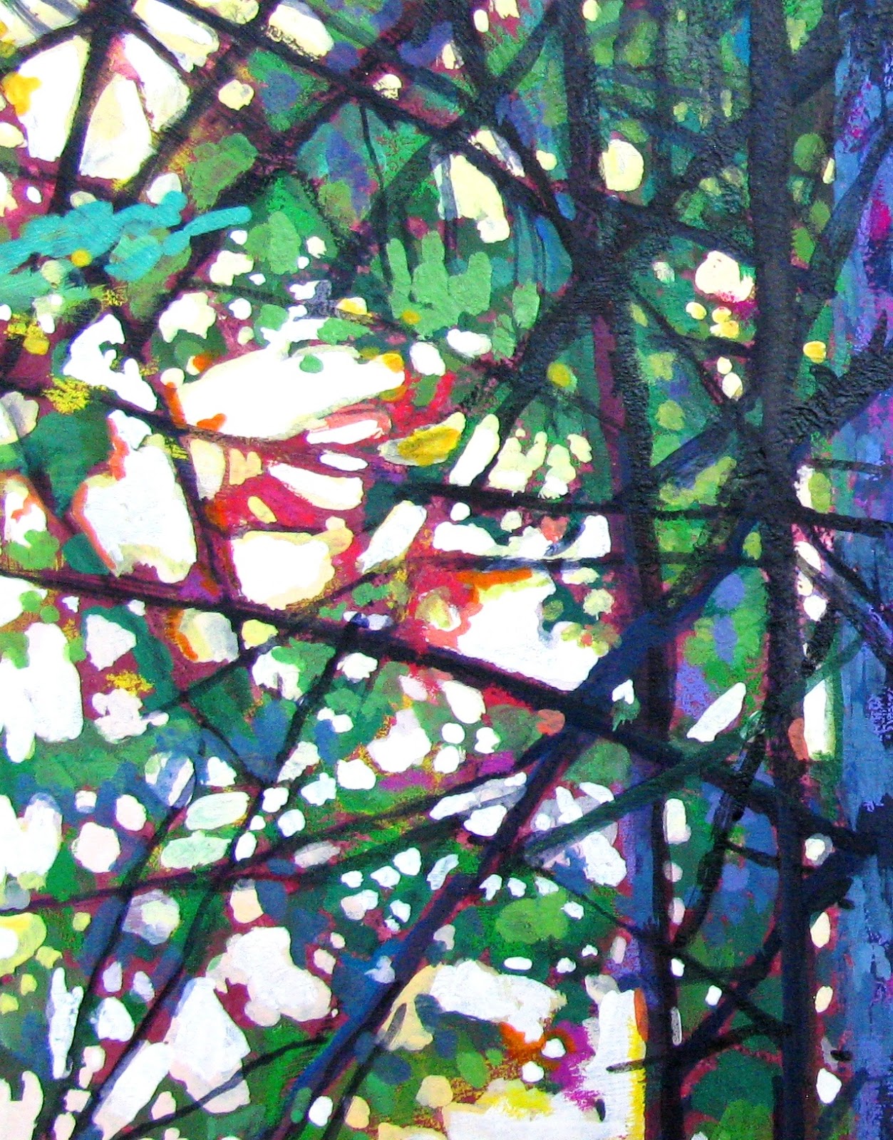
Lastly, my crudely painted leaf is one example of how to use
  color for spacial effects. In the background, the blue is brought closer to the green range blending with the back of the leaf which is painted a bluish green. The two hues almost overlap each other creating an atmospheric feeling. Viridian green for the back of the leaf and Cyan Blue behind it.
The front, I added the Hansa Yellow to the Viridian. The smallest amount of any color can overpower alot of yellow, so go cautiously. At the front of the leaf, I put the complimentary color under the yellow green.This drives this edge forward and sharpens the difference between them. My blacks are never a straight black . I always add a dark rich compliment to exploit the tension between the hues. One of the laws in landscape painting is "The Law of Contrasts". The closer an object is to the veiwer the more definite edges it has, shown either with color and/or hightlights and shadows. The further back in space the less definition there is.
I used an Ultramarine Blue with a smidgen of Alizarin Crimson for the violet. Then I blended the two blues with a Thalo Blue to smooth out the background.
Any combination of red and blue paint will work. Your choice is a preference, not a rule book of right or wrong. This leaf could have been painted hundreds of ways.Over time some combinations become very pleasing. This is the beginnings of STYLE, in particular YOUR STYLE. And when you discover that, you have gone from walking to flying.
Happy Take Off !
 I hope this was useful.
SKF

11.03.2015

Frankenstein - az

This piece is a page out of my art journal celebrating the Halloween spirit. One of the rare pages that has a title, Vessel was inspired by the work of the same name by the art Eloise Pickard Smith. The two pieces have little in common other than being collaged. It was called Vessel because of its three bowls but it really should be called Frankenstein because the body is really just pieces and parts of artwork. The original page had a failed drawing, but there was a part of it I really liked so I gessoed what I did not like in black which added mood and a workable surface. The abdomen is part of the original page along with the Elvira hair. The claw-like hand was added later. The face was next to be added. I added a new pair of eyes and stitches on the mouth to complete my mad scientist machinations. 


10.27.2015

Ignoring the oncoming winter -kes

Every day is cold now, here in the Northeastern U.S.A. Some intelligent person once said, 
"Art is a vacation you can take without ever having to actually go anywhere."

Another intelligent person said, "There are always flowers for those who want to see them."
His name was Henri Matisse. 


10.13.2015

The Painted Universe (SKF)

Hello Creators Extraordinaire,
This is my first stop motion animation.I realized that in a few weeks of my work being on Youtube, more people have viewed my artwork than in the twenty years of a fractured show history. So time to learn a new skill. The storytelling part of this process is like an old friend that I had forgotten about.I actually took poetry classes in art school. I find the combination of visual imagery and a narrative opens up the possiblitie of many new creations. Because this is a learning curve situation, I've become sensitive to the pitfalls as I fumble through the crafting of a different artform. I hope you enjoy the results. If a sixty year- old grandmother can develope her creativity in this manner, imagine what you can do!?


10.06.2015

Make it your own -az

For a project I was working on, I decided to try making tassels. I had seen an article in a magazine and the result was mystical and intriguing.  Except when I did it, it was not so interesting. I followed the directions. I used the proper tools. What went wrong?  I was about to give up and stay in my 'paper only' safety zone but I consulted with Karin who told me: to make it my own. These words are the most over said words in the art world but they are true.

So I altered them with vinyl pieces, wire, spray paint, beads, nail polish, sequins, and more.
 It helped. 

I give my thanks to Jen Cushman whose idea it was to begin with and to Karin who gave me ideas to make it my own.  I don't know if they are mystical or intriguing, but they are now interesting and
 at least 'me'. 


9.22.2015

There's NO Getting it Right in Self Expression. (SKF)


Hello All,

Here's a short art lesson about how we can use the technological tools to change our perceptions.
The first premise is that we see with our minds. When I teach people the basics of drawing they often confuse what they know about an object with what they are actually seeing. For example in a still life a student will draw a symbolic apple, the one that they hold in their mind's eye. This apple is not the same as the one we are looking at, which is specific to the environment it is in. So I will ask the student to shut off what you know about apples and to look without input from elsewhere. We do this by asking very simple questions. What is the shape of the light area ? and the dark area? What are the exact colors of each area? Follow the edge where the apple meets the background, what is the nature of that line? And on and on.


I'm now requesting that we construct a more complex picture in order to expand our imaginations about the scene we may know well. I have drawn and painted the view many times. In it's familiarity I decided to play with a slight abstraction of the original photograph. I transferred the image into Publisher and began to collage portions into different magnifications. I then reassemble the work into many windows making a new wholeness based on the artful unifying of the fragments (see top picture). When I finally manipulated it to my aesthetic liking, I painted the resulting image. This changing of  view points is closer to the way we naturally see. I thought you would enjoy the effect.


9.16.2015

Social Sculpture Day -kes

Collaborative drawing, printmaking, weaving, flower sculpture, spray-paint, clay fun will be happening on the N. Common, Mansfield Center, Mansfield, MA, 12 noon to 4 pm on Saturday September 19, 2015. [Rain date is Sunday September 20].

This event supports the Mansfield Community Mural dedication festival in the town center. Food, music, games for kids and adults, a caricature artist, and more will be happening.
Myself, my dear flawedmystic tribes-women [Sarah & Andrea], and other local artists will be building collaborative public art during the celebration. Interested visitors will help in making creations for a Morini Gallery public exhibit during October at the Mansfield Music & Arts Society [MMAS]. Exhibit sale proceeds will be used to support MMAS programs. Both children and adults are invited to participate in this playful hands-on project. Bring only your imagination, no experience is necessary. Stay for an hour or create during the whole celebration. A $5 materials fee per person applies. For more information call MMAS at 508-339-2822.

9.08.2015

Don't Take The Seat By the Door (SKF)

Well, it's back to school time. I thought I might inspire everyone to think of their clothes as a canvas. We've all been entrained to buy what the commercial world is selling us especially when for years we all received new clothes at the start of school. This year I CHALLENGE you ( pointing my forefinger to anyone who cares) to recreate your old clothes into some really fun personal artwear. Here are a few examples of my creations. The dress was a worn old jersey dress and I turned it inside out, embroidered like a crazy woman, and then added some cool blue pockets.My blue suede shoes, I went really manic with the sharpies especially the metallics. Then I thought about trying to make an experimental purse with the fabric samples in my studio. I took a piece of felt and cut out a double bird for the front. How about a snowflake for a hat or a jacket?
 
 The rag necklace is from my fabric scrap pile. I twisted, rolled and sewed some interesting color combinations into a long rope. Like a magpie, I've collected bits and pieces of sale beads, old jewelry, and anything I find in the road.

 Your creative ideas are limitless so don't let an opportunity to express yourself slip by and this is where I explain the title. When I was younger, I would go to a restaurant and often the hostess would try to get rid of the worst seats by attempting to seat the uncomplaining folks next to either the kitchen door or in cold weather, the front door. I've taken the statement," Don't take the seat by the door!" as a kind of code for we're all sold something less than acceptable, which we unquestionably buy. For instance did you know there is actually a Color Trends Council who determines the colors for designers of clothes, furniture, drapery, and other consumer goods. Did I ask to be dressed from colors that are from "The Night of the Living Dead?! So do your own style and make it wild. Great cultral trends always come from the street up, not the other way around. Wear it proud. A special shout out to my nephew who looks awesome doing his own thing.

Don't take the world they'll give you
 ( cheap kewpi doll philosophies).

Make it the way you want it!


Full of what you love.


Now, let's get to work.